Atlanta Airport Mobile App
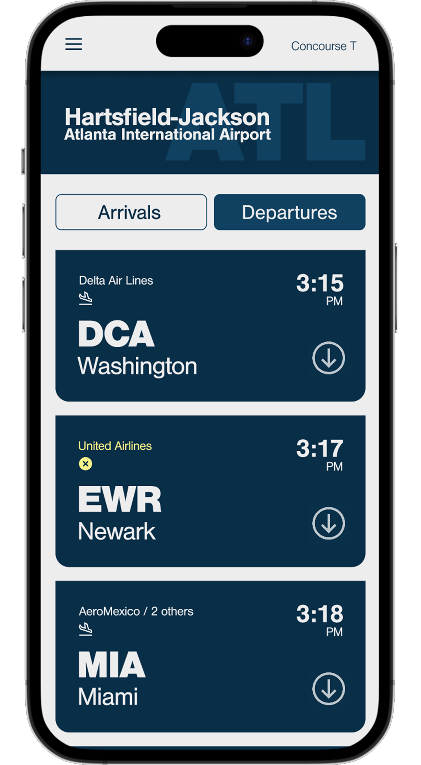
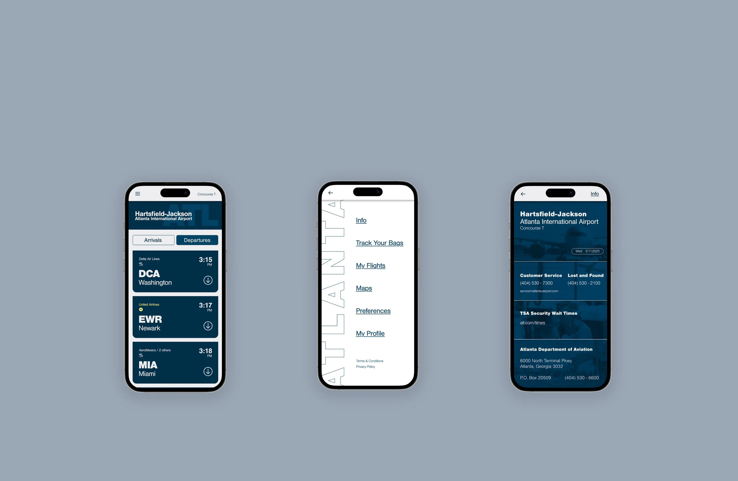
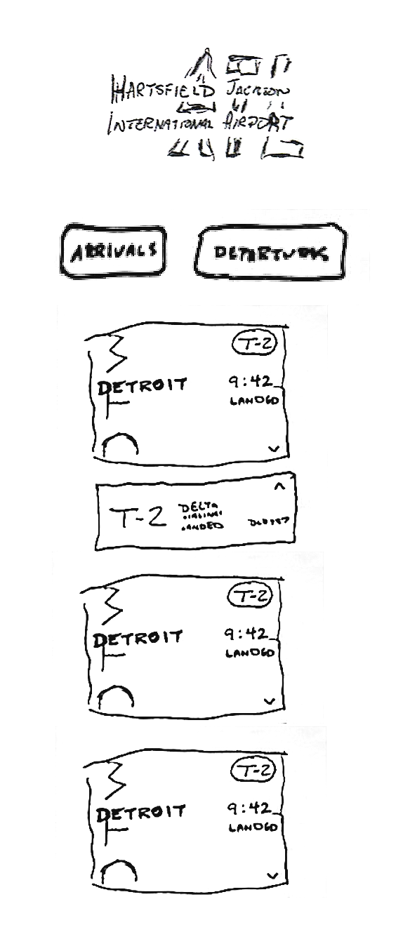
The objective was to design a flight information display system for Hartsfield-Jackson Atlanta International Airport. While creating the design I kept in mind the large variety of users that pass through an Airport. My final result is made to be accessible for those with visual, technological, and cognitive limitations. To achieve this outcome, I utilitized a strict set of typographic colors, hierarchies, and grids.
Inspiration
I drew inspiration from various airline apps, mostly to gain a feeling of what a composition could potentially look like. The one that I found most compelling was Delta Airlines. My biggest inspiration, though, was the New York City Subway System which was designed by Bob Noorda and Massimo Vignelli. It is highly regarded as an effective way-finding system for one of the busiest cities in the world. The system is characterized by its use of a sans serif typeface, Helvetica, as well as its strong display of hierarchy. 
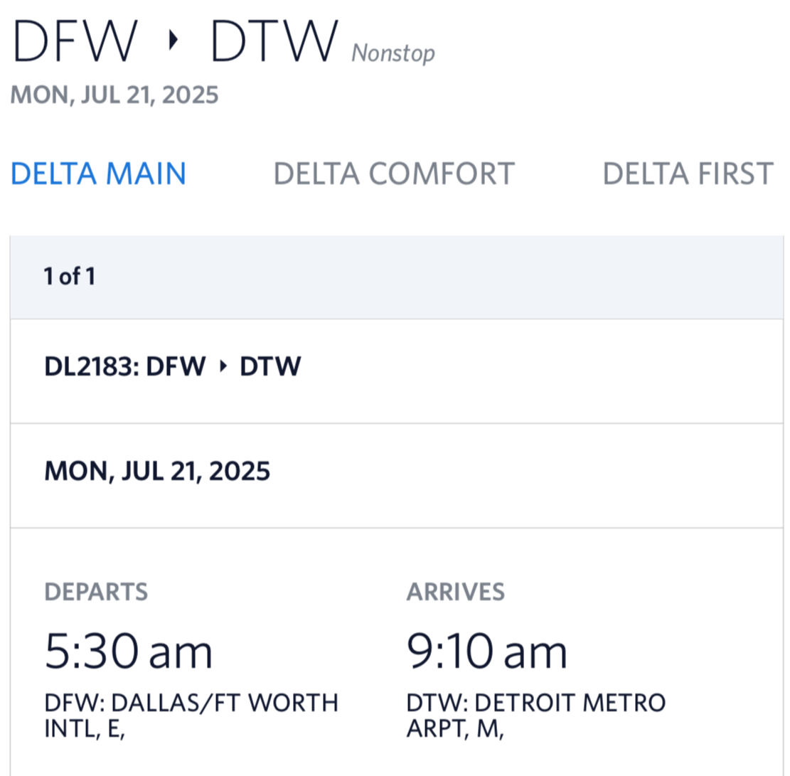
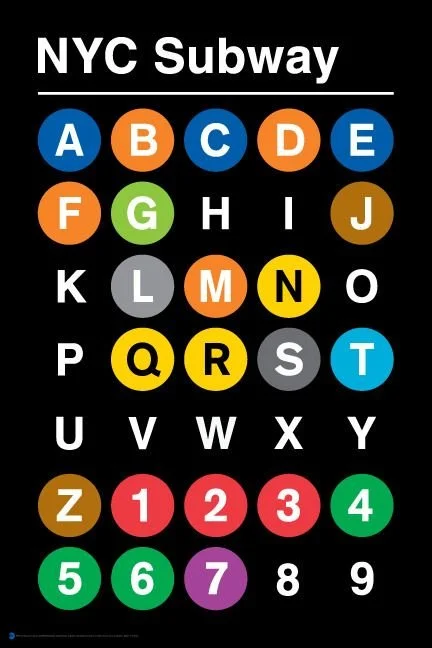


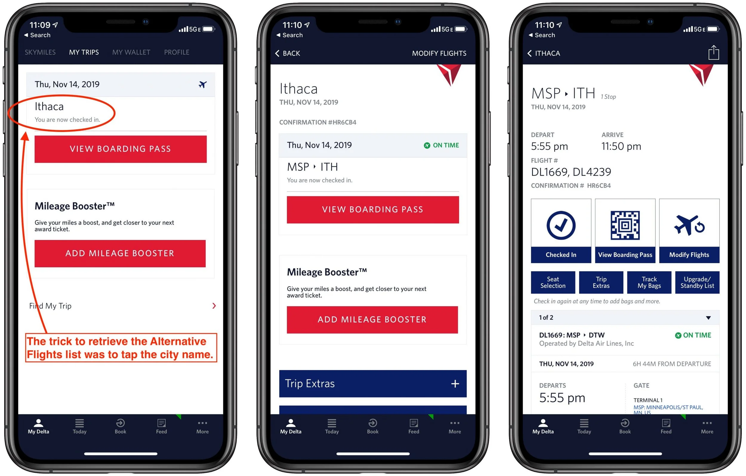
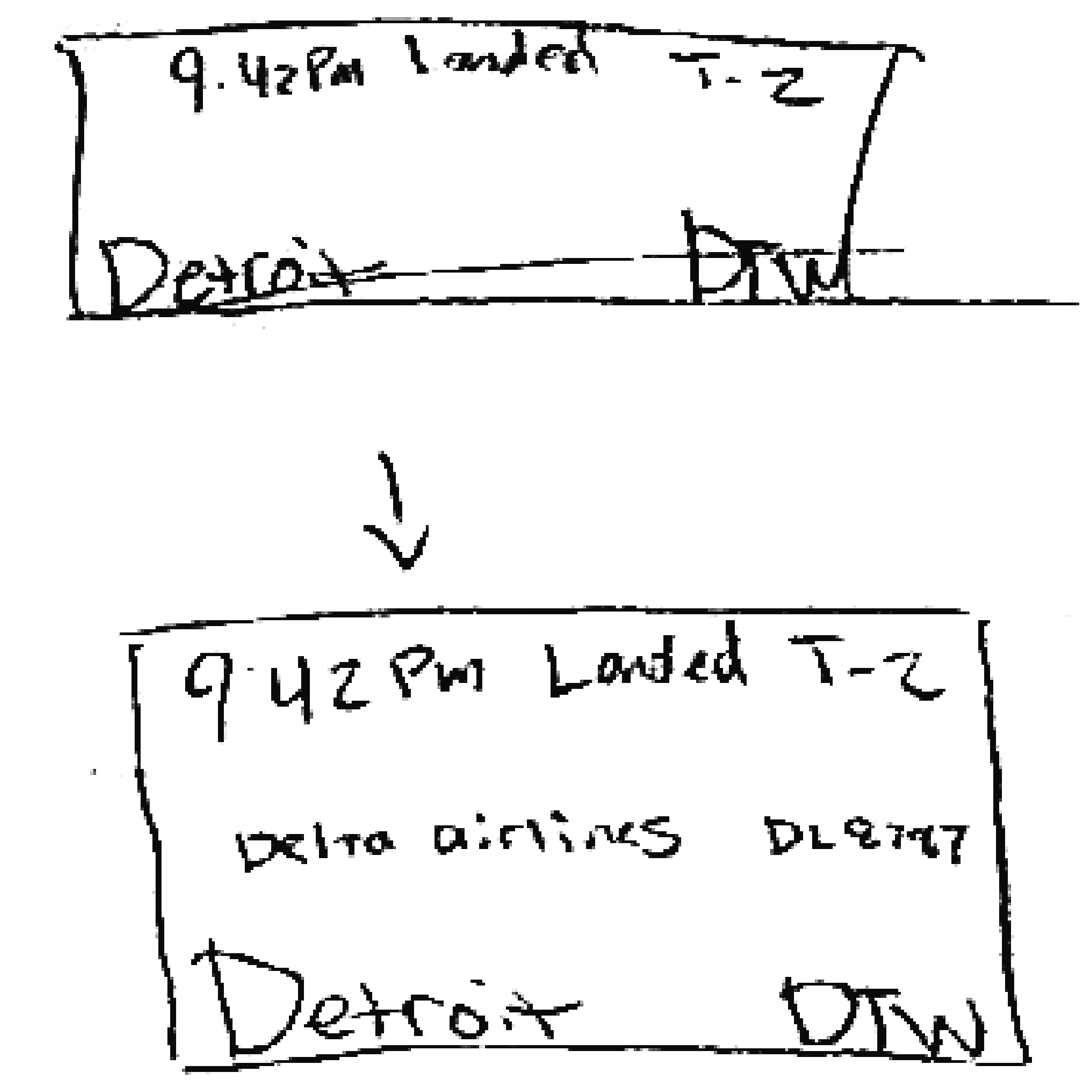
Sketches
Flight Information Buttons
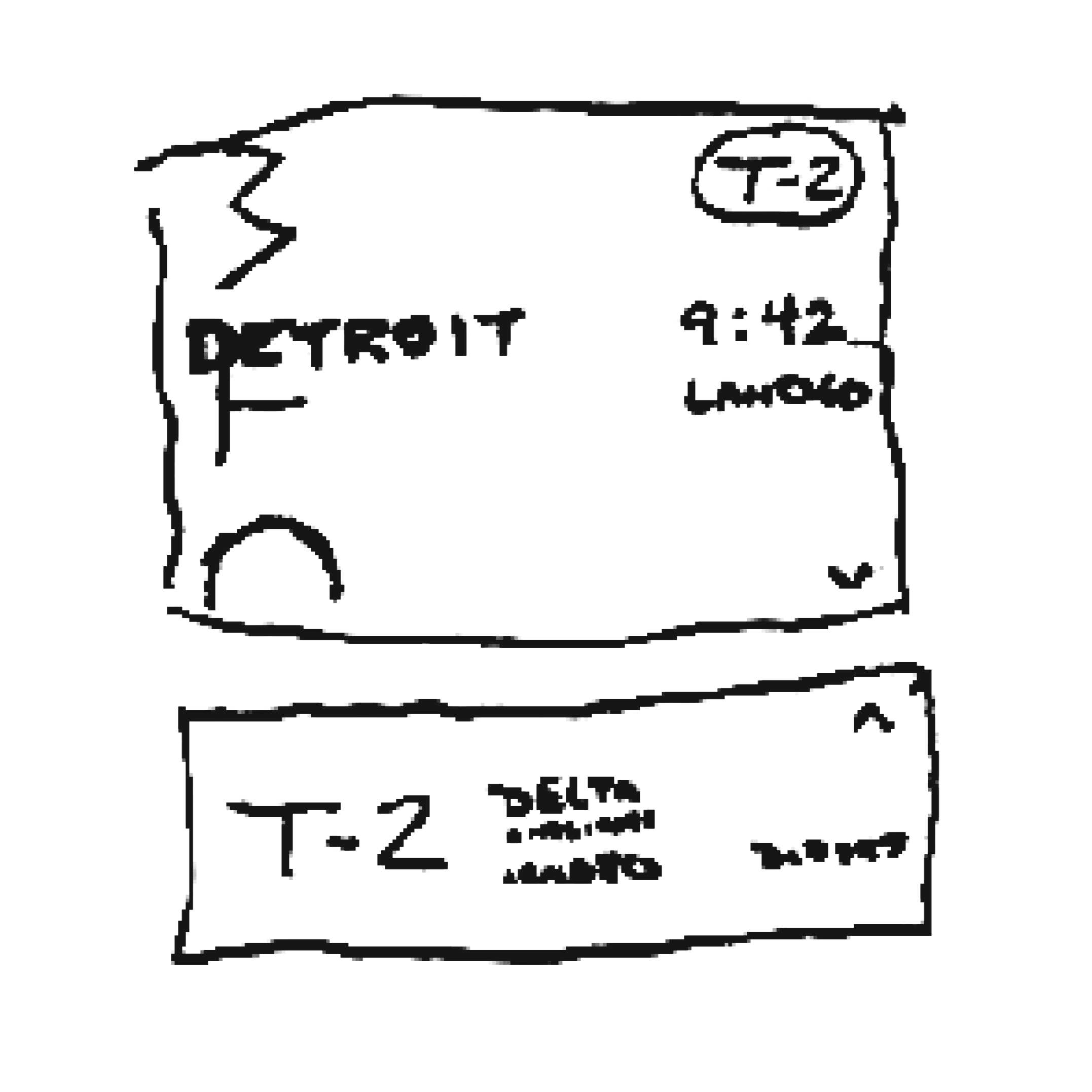
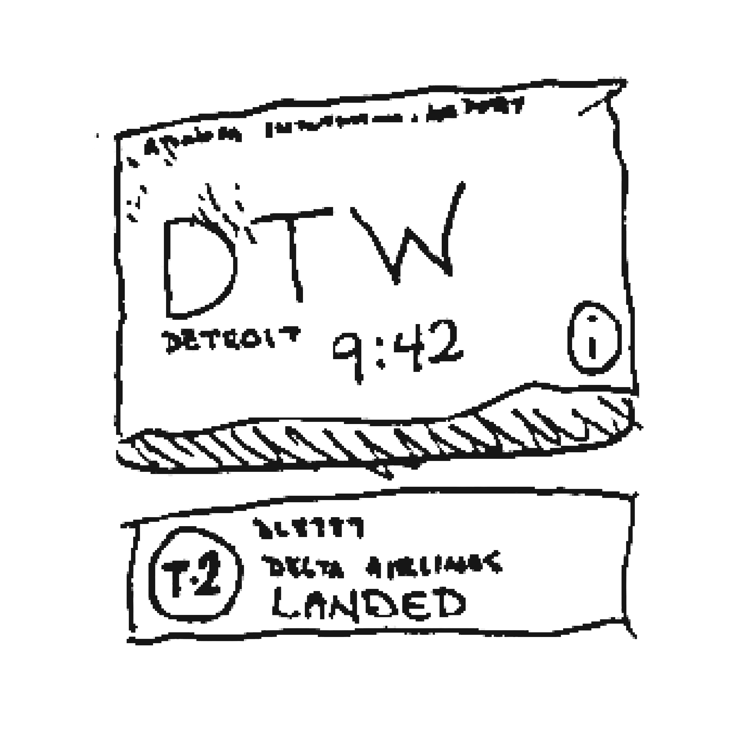
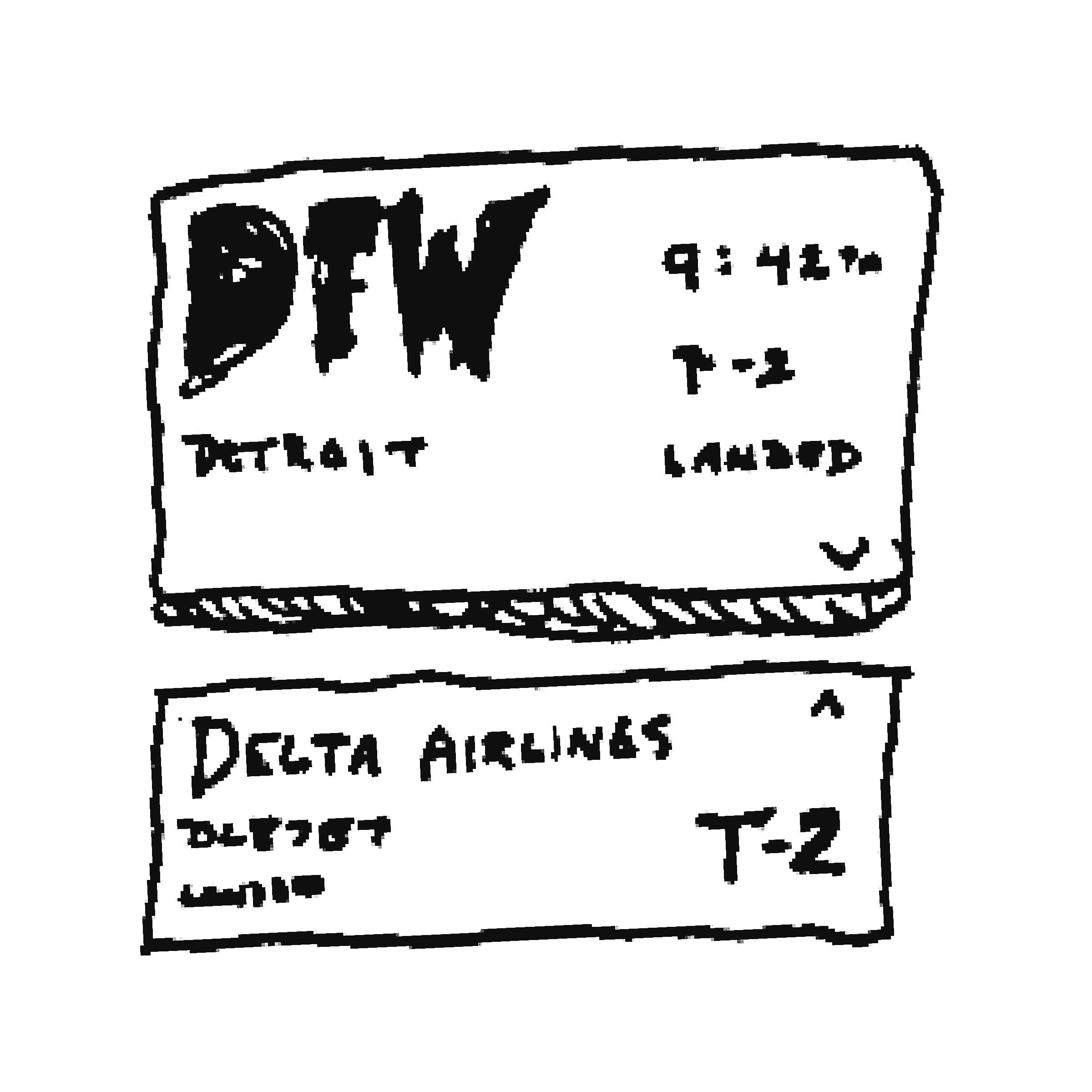
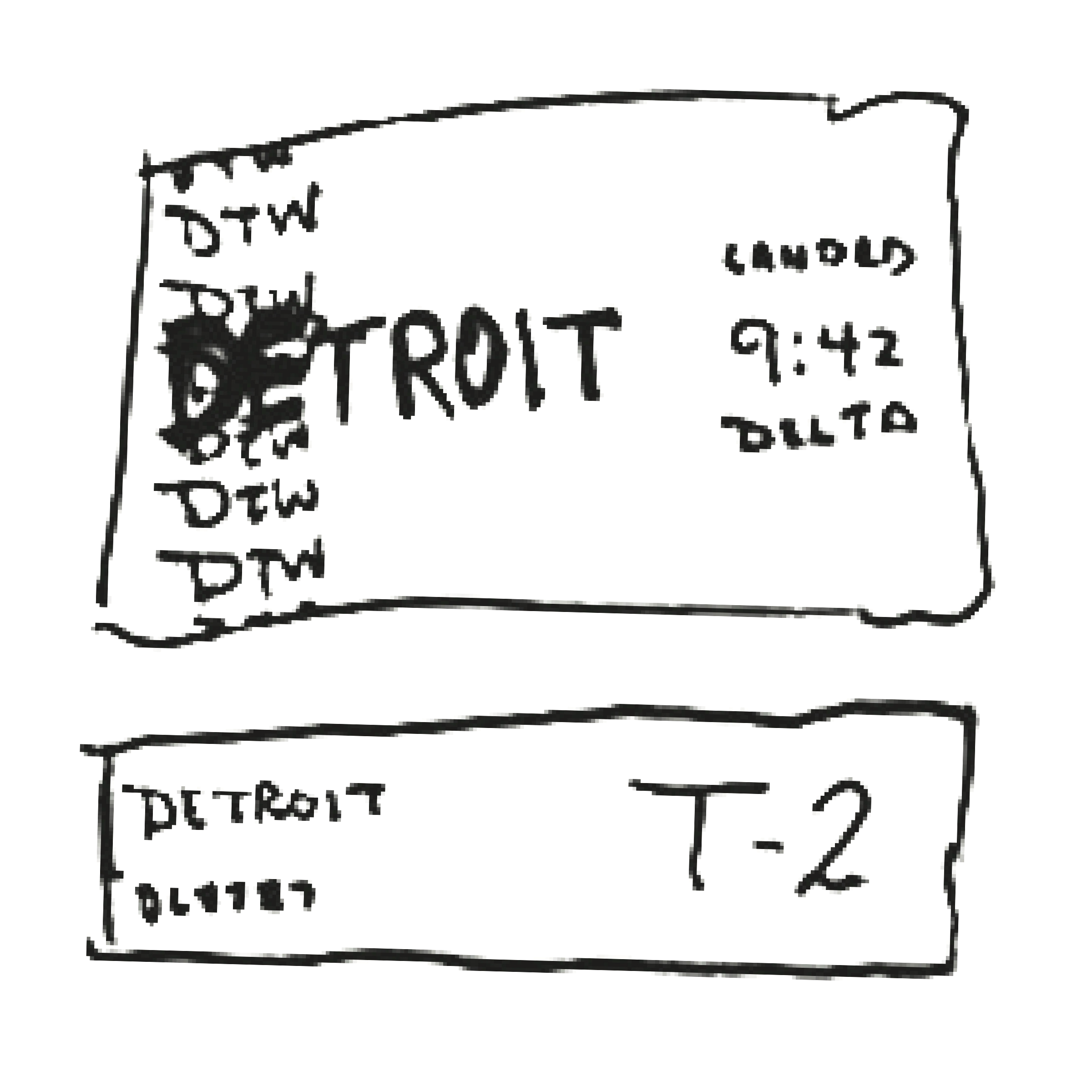


Interface Layouts
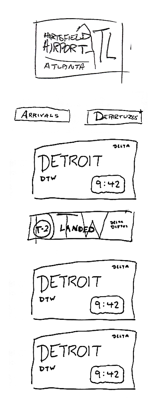
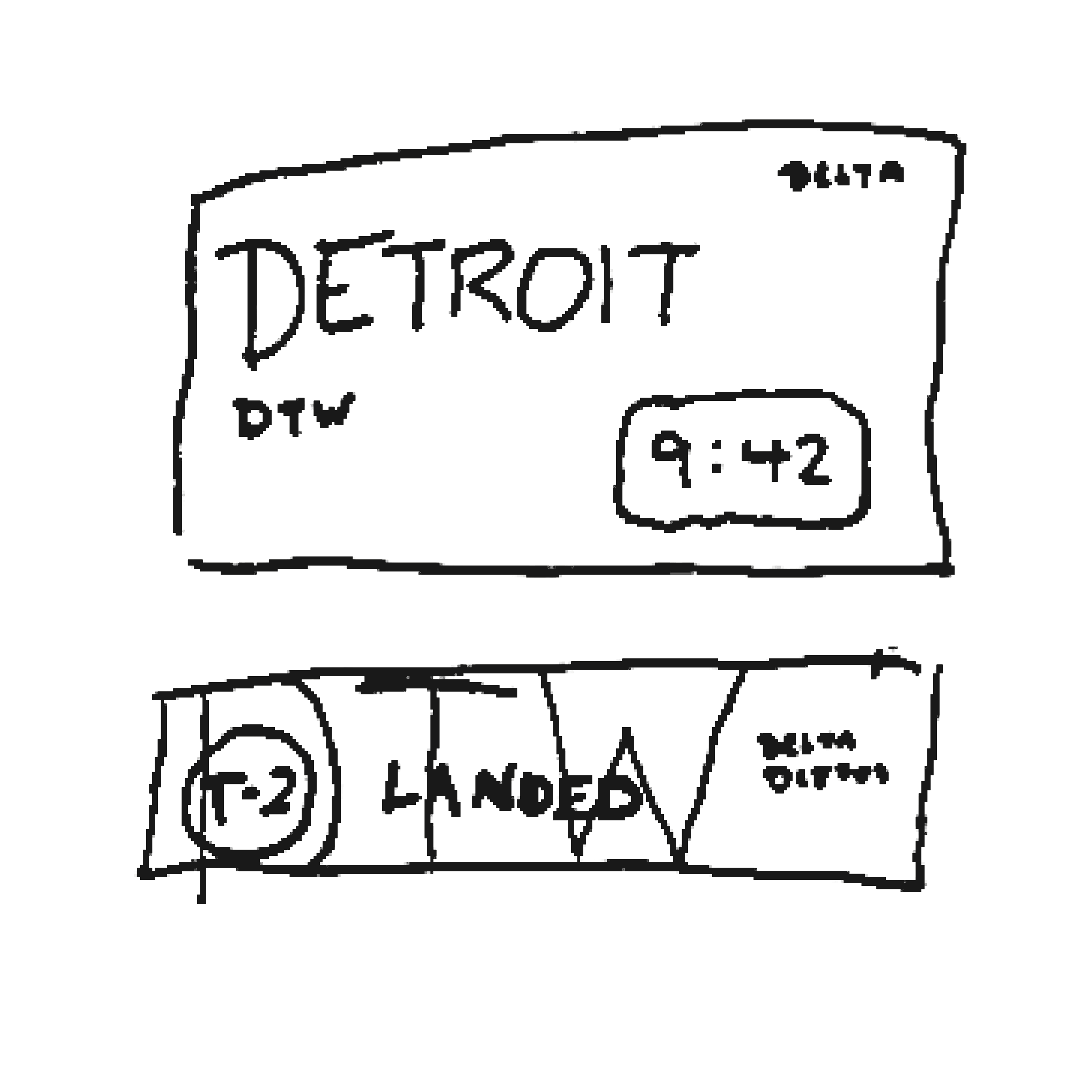
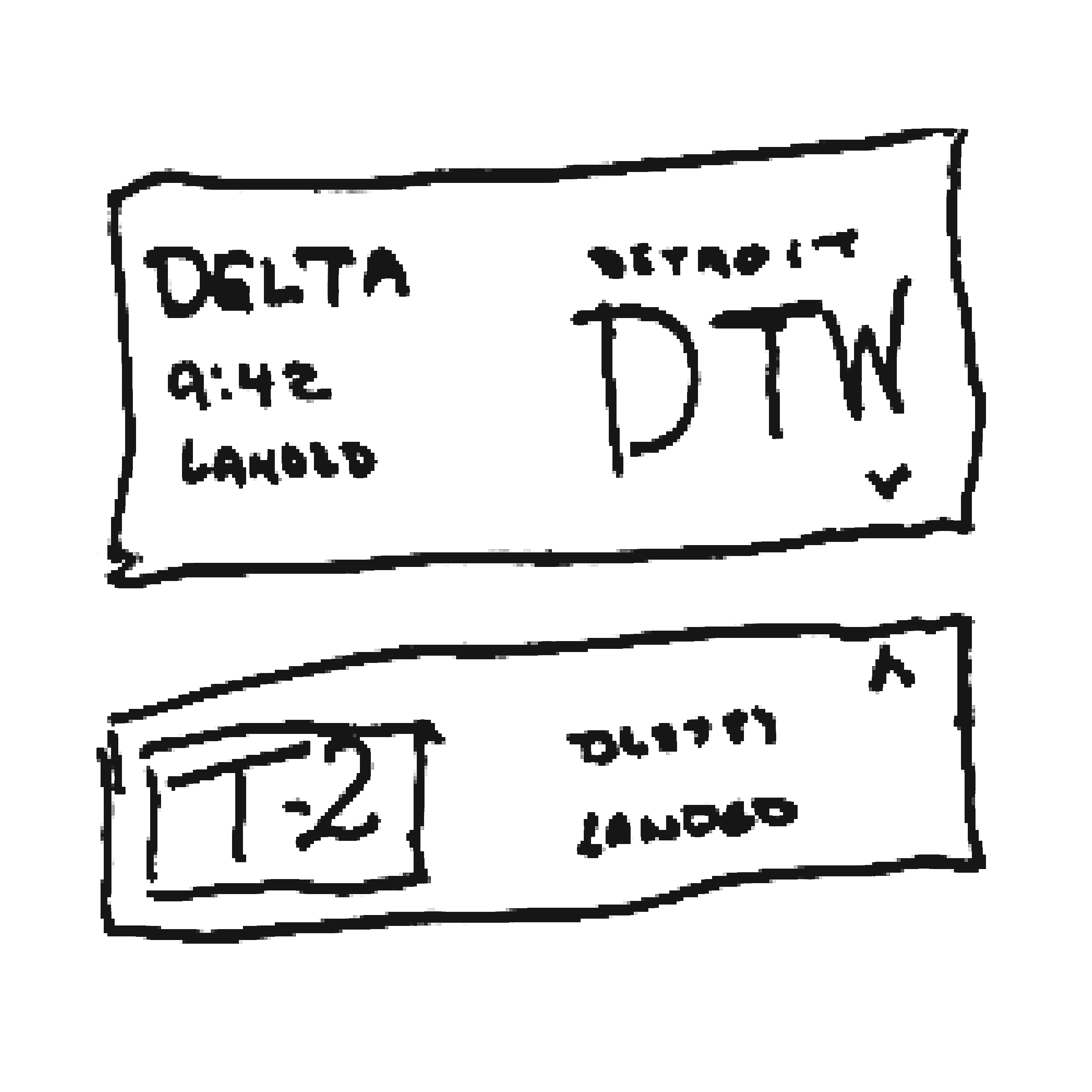
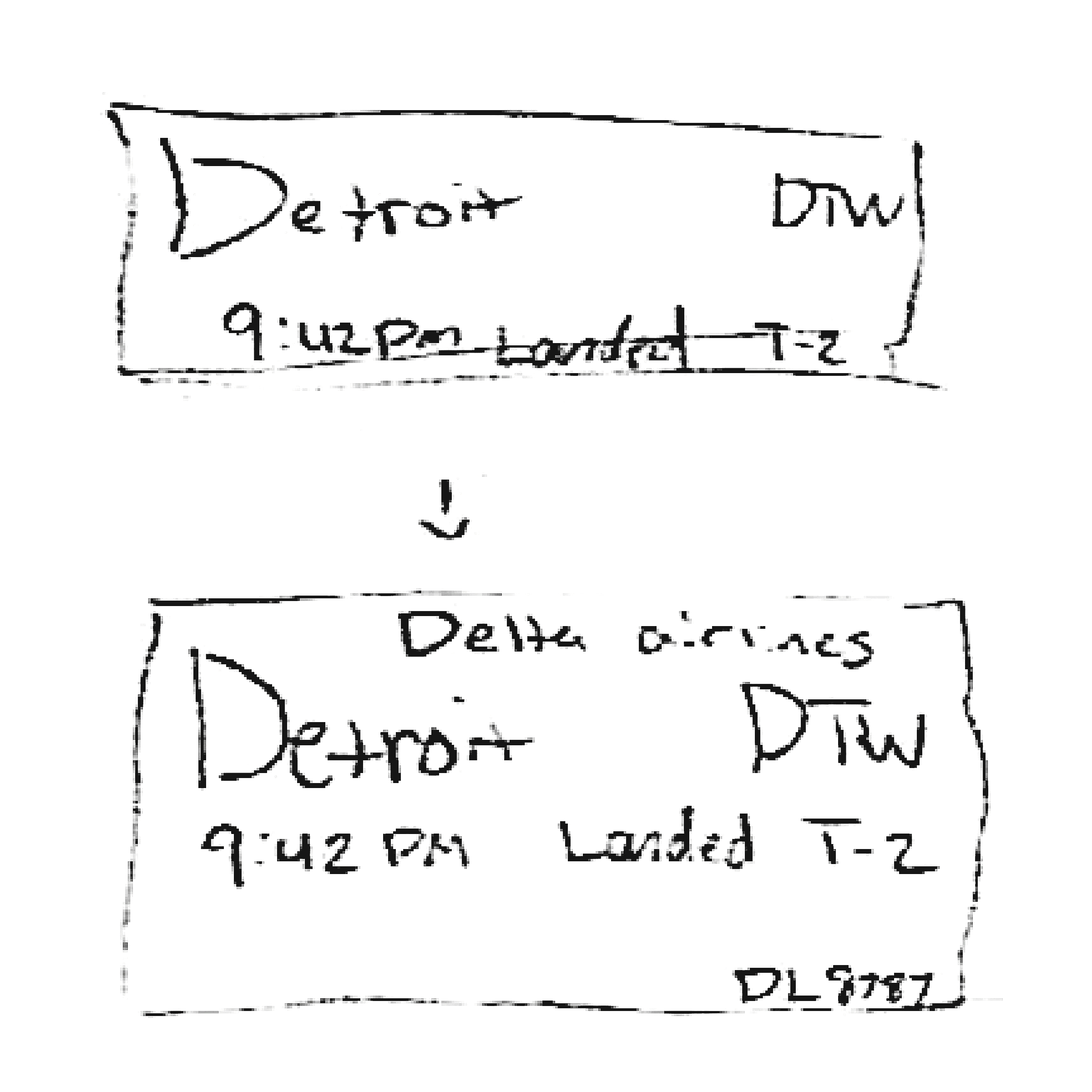
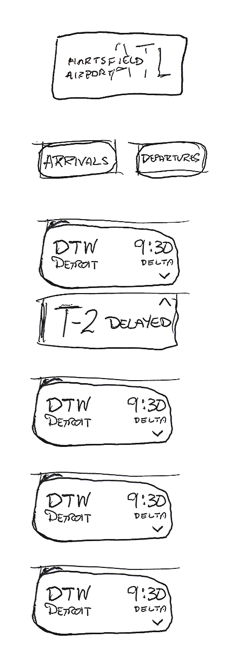

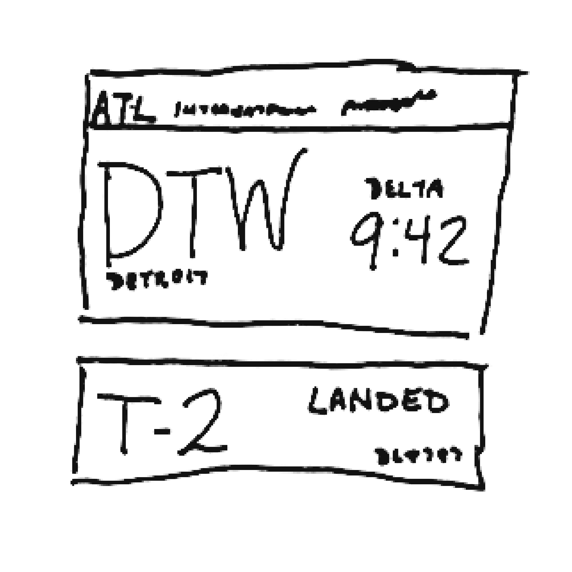


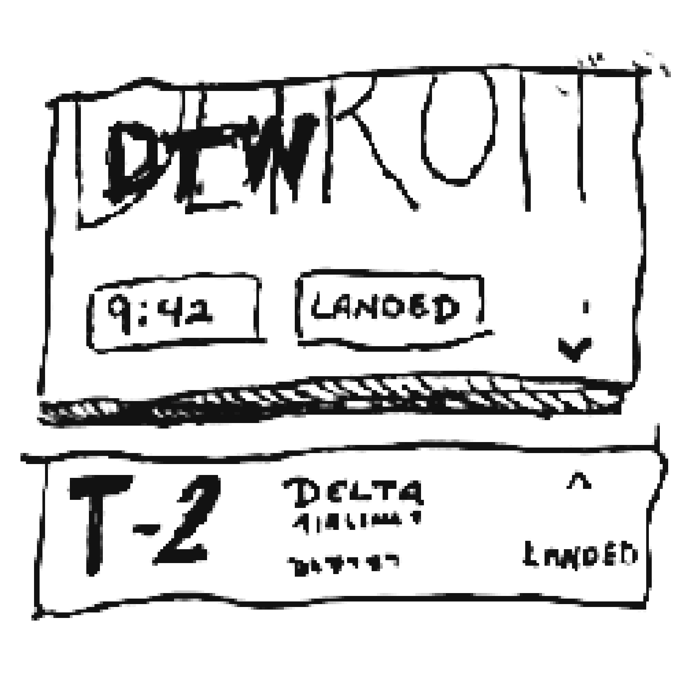
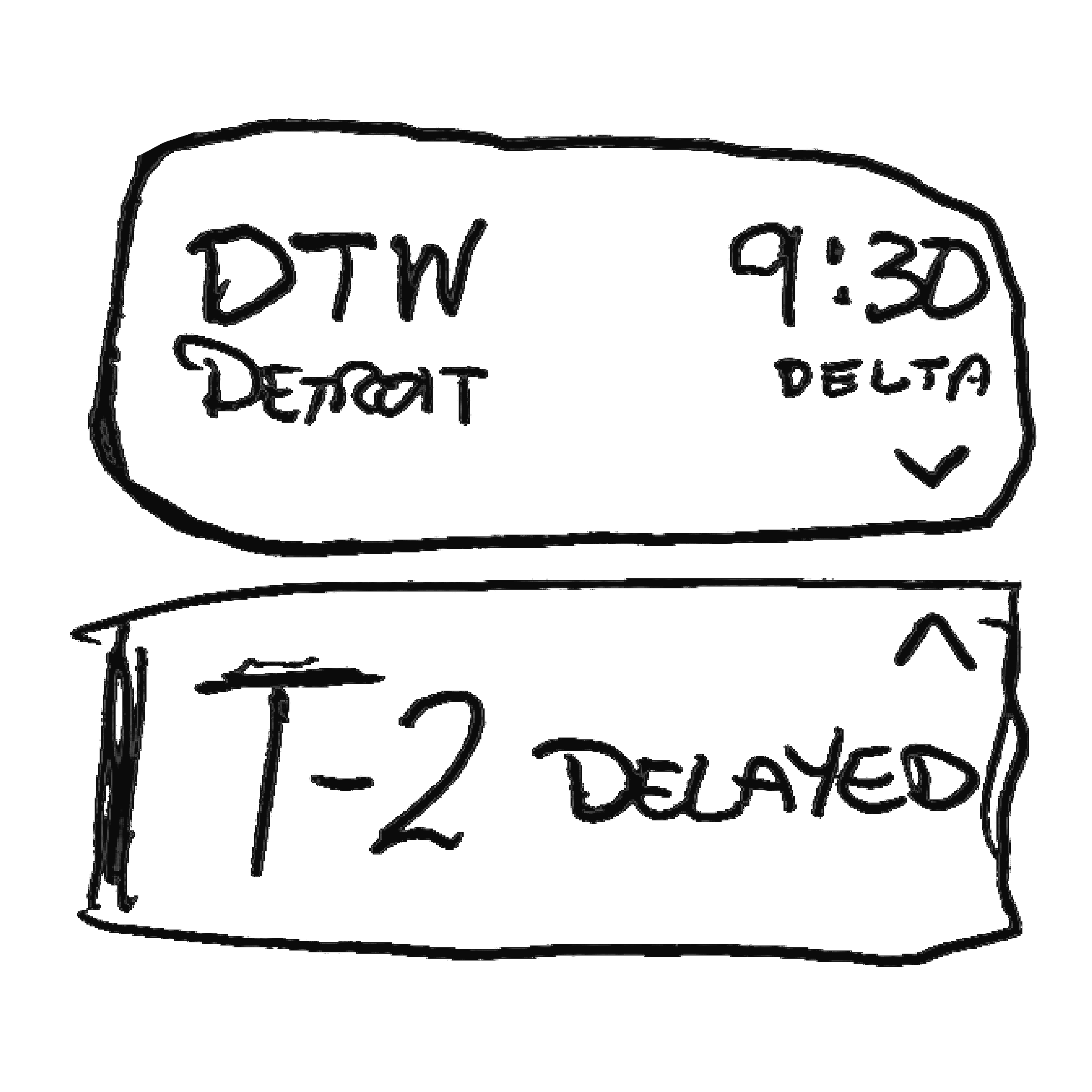

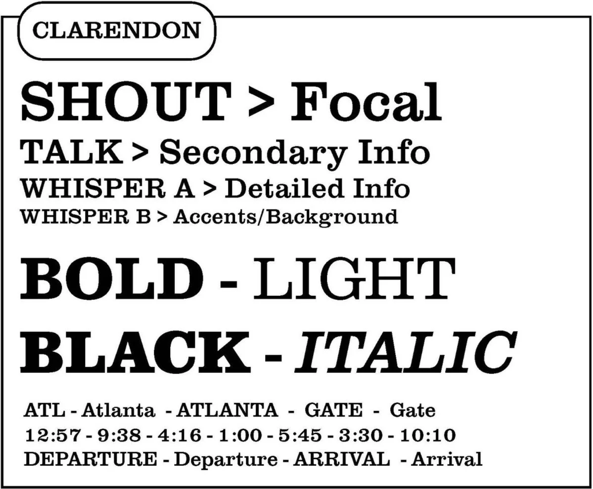
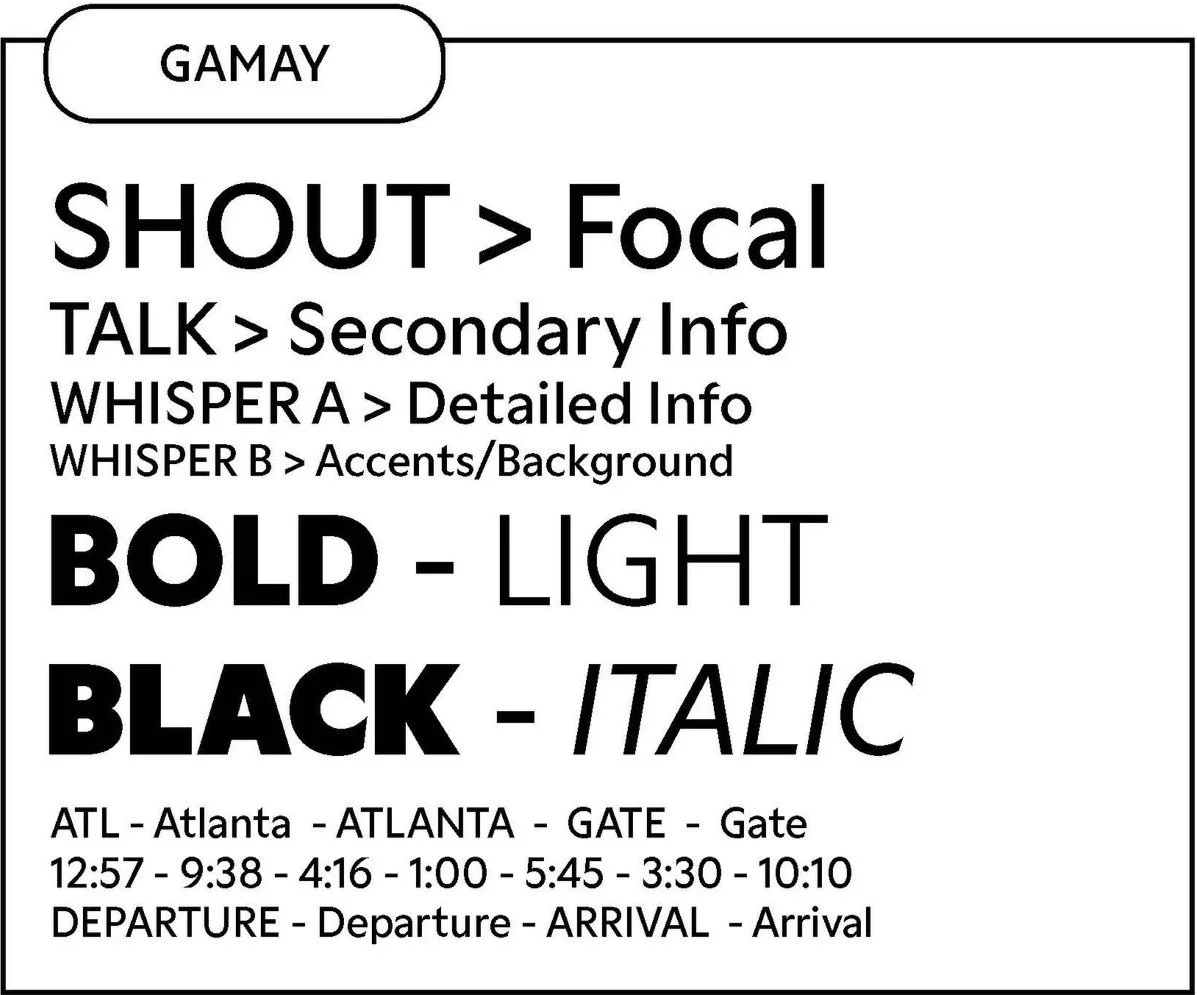
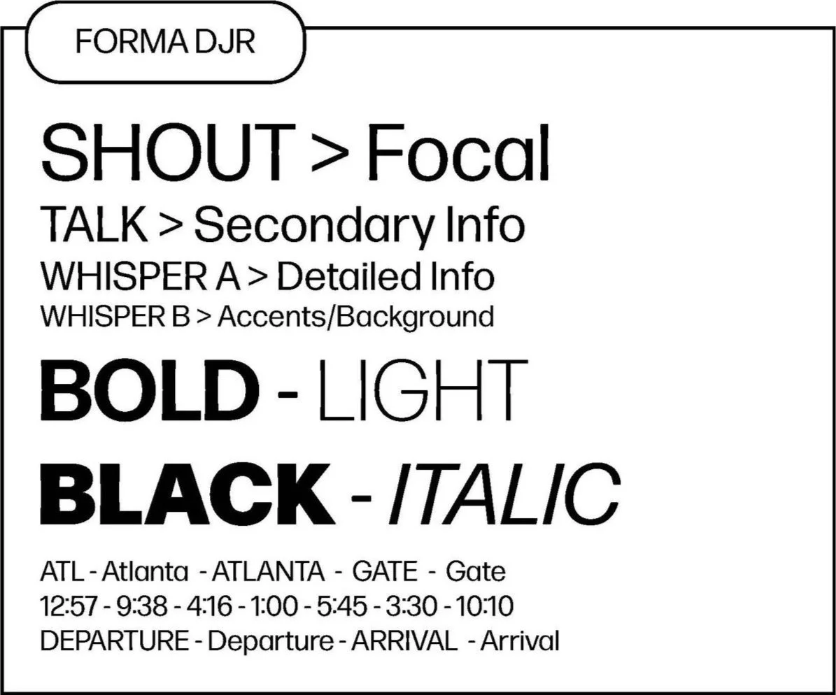
Typographic Studies




Color Studies
Study 1
Dark gray is associated with professionalism which can help gain the trust of a user. Study 2
Brown is associated with reliability and stability which are both desirable in an airport setting.Study 3
Blue is associated with calmness which can create an approachable design system.Study 4
Dark red is associated with seriousness and can also evoke a sense of urgency which is useful to have in an airport.


Design Systems
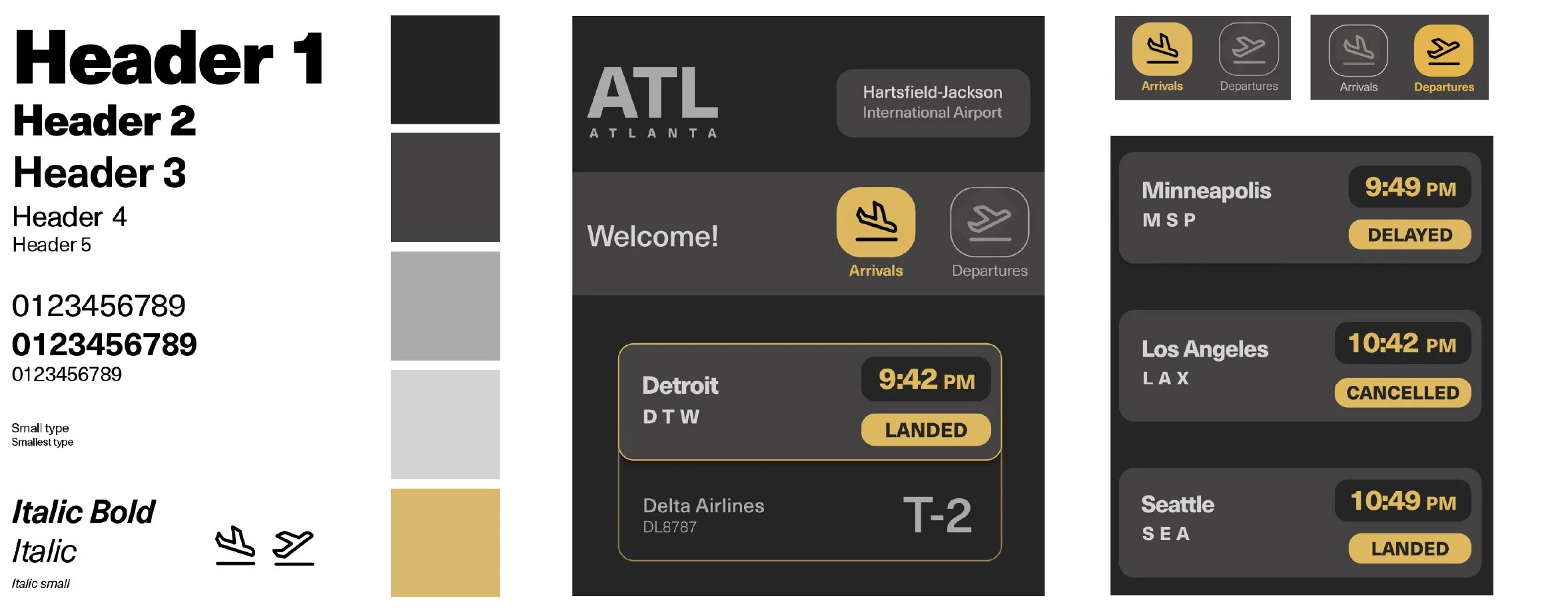


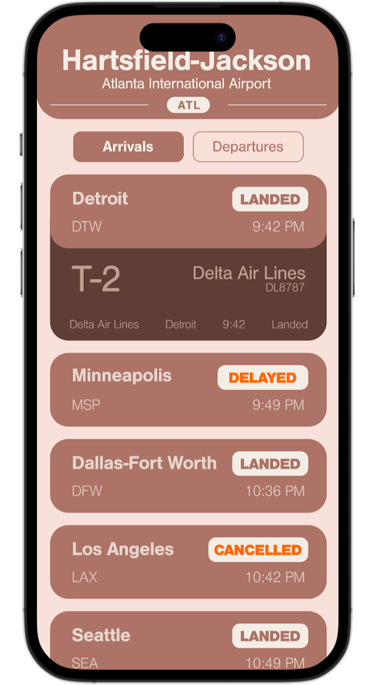
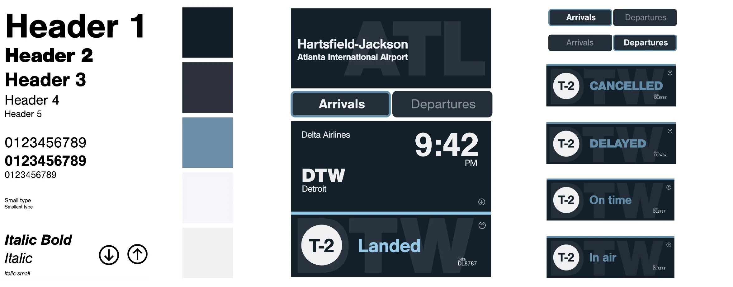


Digital Refinement
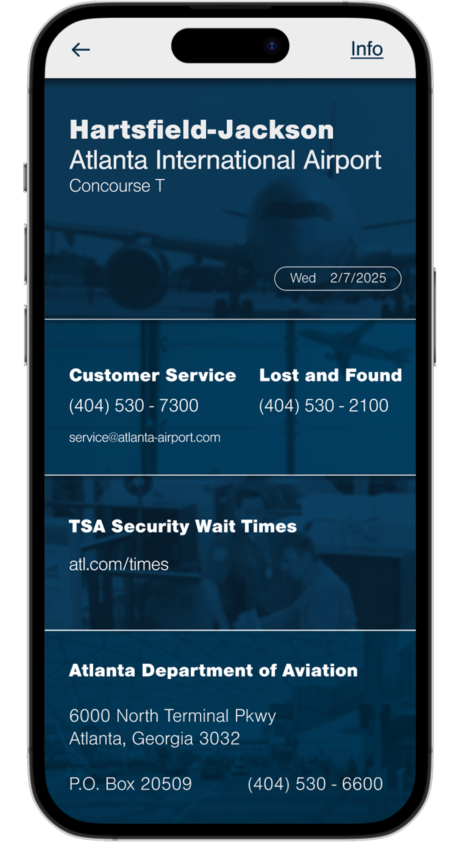
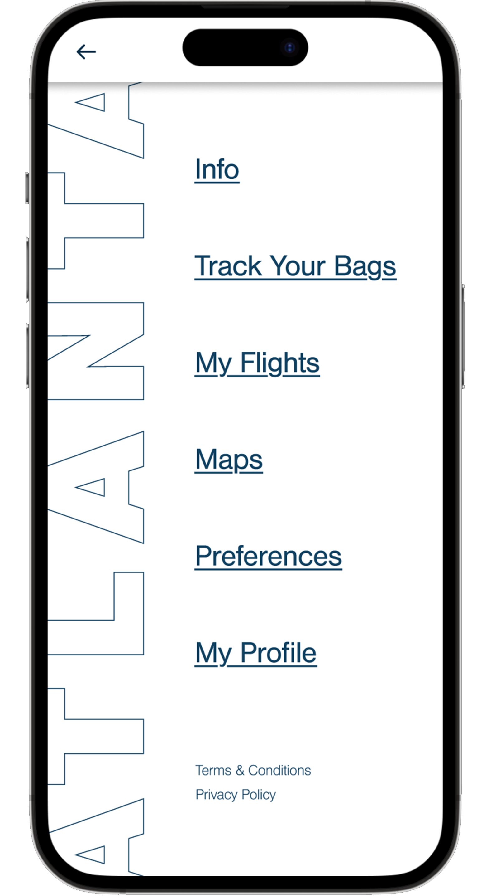
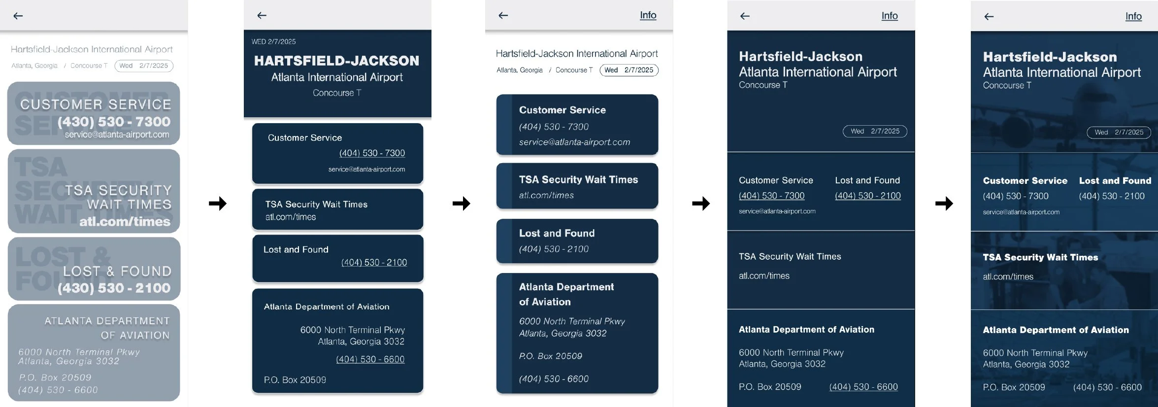
I decided to move forward with the blue oriented design system. A few of the key iterations I made included increasing overall contrast, brightening/saturating the color scheme and creating a less crowded design. I also was given the task of creating an screen with useful information for travellers. I included my process which eventually resulted in a design that fit well among the system I had created.Display Screen Iterations


Information Screen Iterations
Final
